In data analytics, presenting your insights clearly is just as important as uncovering them. Choosing the right chart can enhance understanding, support decision-making, and bring clarity to complex datasets. But with so many chart types available, it can be challenging to know which one fits best. This guide will help you match your data to the appropriate visualization method for maximum impact. If you’re looking to develop these skills further, enrolling in a Data Analytics Course in Hyderabad at FITA Academy is a great way to gain hands-on experience and practical knowledge.
Understand the Purpose of Your Analysis
Before selecting a chart, it’s important to understand what you want to communicate. Are you attempting to show trends over time, compare categories, explore relationships, or highlight part-to-whole breakdowns? Each objective requires a different approach to visualization.
For example, if you’re analyzing monthly revenue growth, a chart that highlights changes over time will serve you better than one that focuses on individual product performance.
Know Your Data Types
Data can generally be classified as categorical, numerical, or time-based. Categorical data includes labels such as product types or regions. Numerical data involves quantities like sales figures or conversion rates. Time-based data includes dates or sequential periods. Understanding these classifications is a fundamental concept taught in a Data Analyst Course in Pune, where learners are trained to work with diverse data types effectively.
Understanding your data type helps narrow down the chart choices. For example, categorical comparisons are often best shown with bar charts, while numerical distributions are better visualized using histograms or box plots.
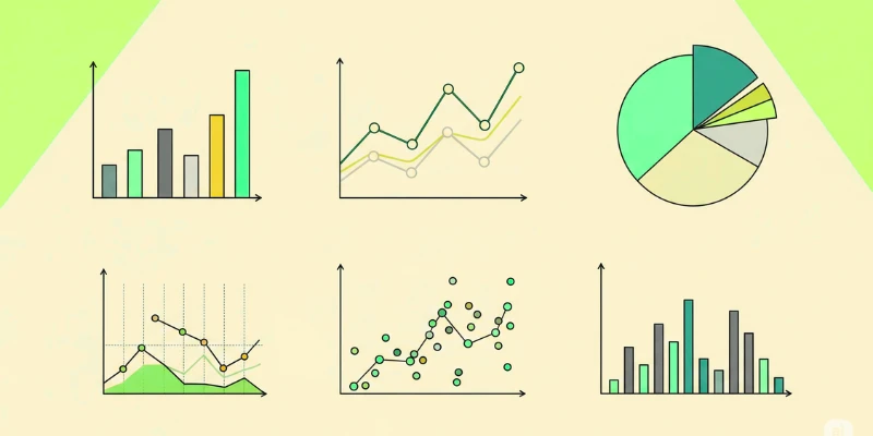
Choose Charts Based on the Message
Here are some common chart types used in data analytics and when to use them:
1. Bar Chart
Bar charts are excellent for side-by-side comparison of various categories. Whether you’re showing sales by region or customer count by segment, bar charts allow for quick identification of the highest and lowest values.
2. Line Chart
Use line charts to display trends over time. They are effective in showing patterns, peaks, and dips in data such as monthly website traffic, daily sales, or year-over-year performance.
3. Pie Chart
Pie charts are useful when showing proportions of a whole. However, they are best used when you have a limited number of categories and want to emphasize the relative size of each segment. Avoid them if precise comparison is critical.
4. Scatter Plot
When your goal is to explore relationships or correlations between two variables, scatter plots are highly effective. For instance, you might use one to see the relationship between advertising spend and revenue. Techniques like these are commonly practiced in a Data Analyst Course in Mumbai, where learners gain hands-on experience in visualizing and interpreting data relationships.
5. Histogram
Histograms show the distribution of numerical data. They are commonly used to explore the frequency of values within a dataset, such as customer age groups or transaction amounts.
Keep It Simple and Clear
The goal of any data visualization is clarity. Avoid cluttering your chart with unnecessary labels, colors, or 3D effects. Simpler visuals often communicate better, especially when shared with a non-technical audience.
Also, be mindful of your audience’s familiarity with different chart types. If they are not data-savvy, stick to familiar formats that are easy to interpret.
Choosing the right chart for your data can greatly improve the effectiveness of your analysis. By aligning your visualization with your objective and data type, you can ensure your insights are not only seen but truly understood. In data analytics, a well-chosen chart does more than display numbers. It tells a compelling story. These visualization techniques are a core part of what you’ll learn in a Data Analytics Course in Delhi, where practical application meets industry-focused training.
Also check: The Importance of Real-Time Analytics in a Fast-Paced World